|
|
New games every week!
Couple of Tweaks
Blog
15th August 2022
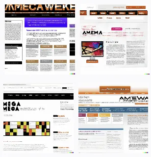
The other day, I asked Dall-E to come up with a few layout suggestions for the site, and in amongst it's four different outputs, the top left one peaked my interest.
The idea of reducing EVERYTHING down to little boxes seemed kind of ideal, as far as squeezing a little more stuff into a page. -=-=-  The site's had a bit of an overhaul over the past few days, as a result, and I've just uploaded the changes. Almost all posts are now in the smaller square size posts that Pixelart and Poetry used to be in. The only things NOT in the smaller size are the Games, which still get the full width boxes. Once clicked into, all pages are as they used to be. In addition, only "today's" Pixelart and Poetry will appear on the front-page. Clicking on either will take you to their section, then you'll have to click through again to see the actual pixelart. Is that OK, or is that one click too far? Lemmie know! The biggest change is how the search function pops up. Previously the Up/Down icons on the "xxx results" bar would toggle between sorting by old->new and new->old. Now, however, they've been replaced with a Search/Filter icon pair, bringing up the default search bar... I think that's now much more functional due to the fact you can bring it up at will, instead of farting about trying to trick the site into getting that to appear!! Anyhoo, that's the tweaks. Nothing "massive", just enough to keep the site looking less like something written in the 90's. ... Please do let me know what you think of the tweaks, and whether they're "not enough", "just enough" or "too much"! Views 78, Upvotes 13
Tweaks
New games every week!
|


