|
|
New games every week!
Tweaking the Editor's Interface
Blog
28th August 2018
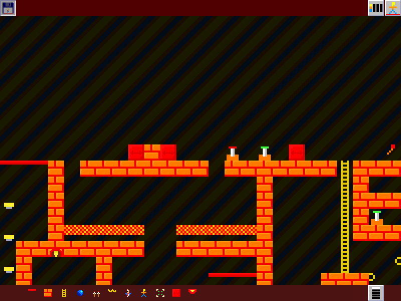
 The Editor definitely needs a decent GUI, but I'm unsure whether I'm better off with a simpler one, or something a little more fully featured. -=-=- In the screenshot above, there's a Save icon top left, a Test icon top right alongside a single-button level select (4 levels, leftmost is currently selected) On the bottom are a row of selectable tiles, along with a button to select from the other 4 rows of tiles. I'll be honest, it's not the most intuitive of editors, and it definitely needs a rethink. Trying to find something that fits onto the 3DS is proving to be the most difficult part of this process, as there's really not an awful lot of screen-estate when you need to fit everything onto a single screen. I might continue on this path, or try coming up with a completely different style. I'm not currently sure. Stay tuned to find out!! 
Views 166, Upvotes 26
Daily Blog
,
575
,
Jnkplat2018
New games every week!
|


