|
|
New games every week!
Still Going Slow
Blog
20th April 2019
Amazing how much a funeral hits you. I spent all day yesterday sitting about, playing Smash Bros, watching various YouTube things, and generally not really bothering to do any sort of coding whatsoever.
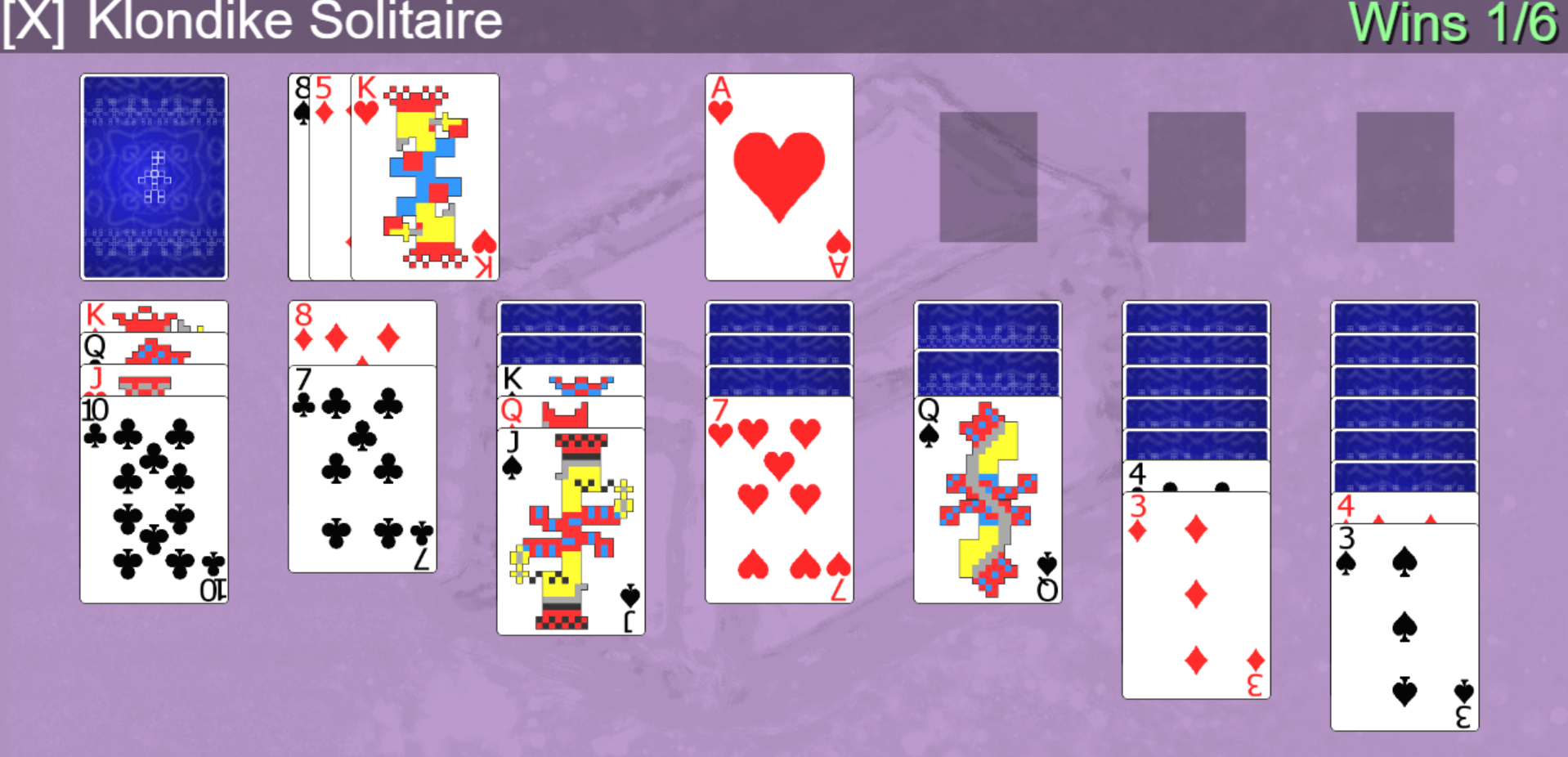
Maybe today will be more productive? Meanwhile..Over on the Testing the Width post.. Alan suggestsJust my opinion, but the individual cards could use a tiny bit more margin. I prefer the top picture. Not because of the aspect ratio of the cards themselves, but because it has a more pleasing ratio of cards to inter-column gaps. -=-=- Trying to find the right size for the information in the corner of the cards, alongside the space between the card, to allow at the very least the value of the card to be readable, has been one of the hardest parts of making this whole Shoebox collection. If you scrunch up the cards into a small narrow window, you can get it to do this..  ..which is less than ideal, since you can't identify what a number of the cards actually are. As a result, I've been rather reluctant to add or remove margins and padding to any of the objects, for fear of making that kind of scenario any worse than it already is. Margins within the cards will make the issue worse, as all you'd be seeing is whitespace around the edge of the card, rather than any kind of card's content. Margins around the outside of the cards would (I think) require me to shrink the cards down a teensy bit, which would then make things unreadable on a smaller screen, let alone trying to pick specific piles of cards up with your big stumpy fingers!! The different widths of cards are probably more than enough of an issue to contend with, for now. Perhaps if I create a super-high-resolution edition, I might take the time to add a bit of padding to things, but for the meantime I'm worrying about how things look on a tiny iPhone more than anything. Views 60, Upvotes 7
Daily Blog
New games every week!
|


