|
|
New games every week!
Menu Coming Together
Blog
17th June 2019
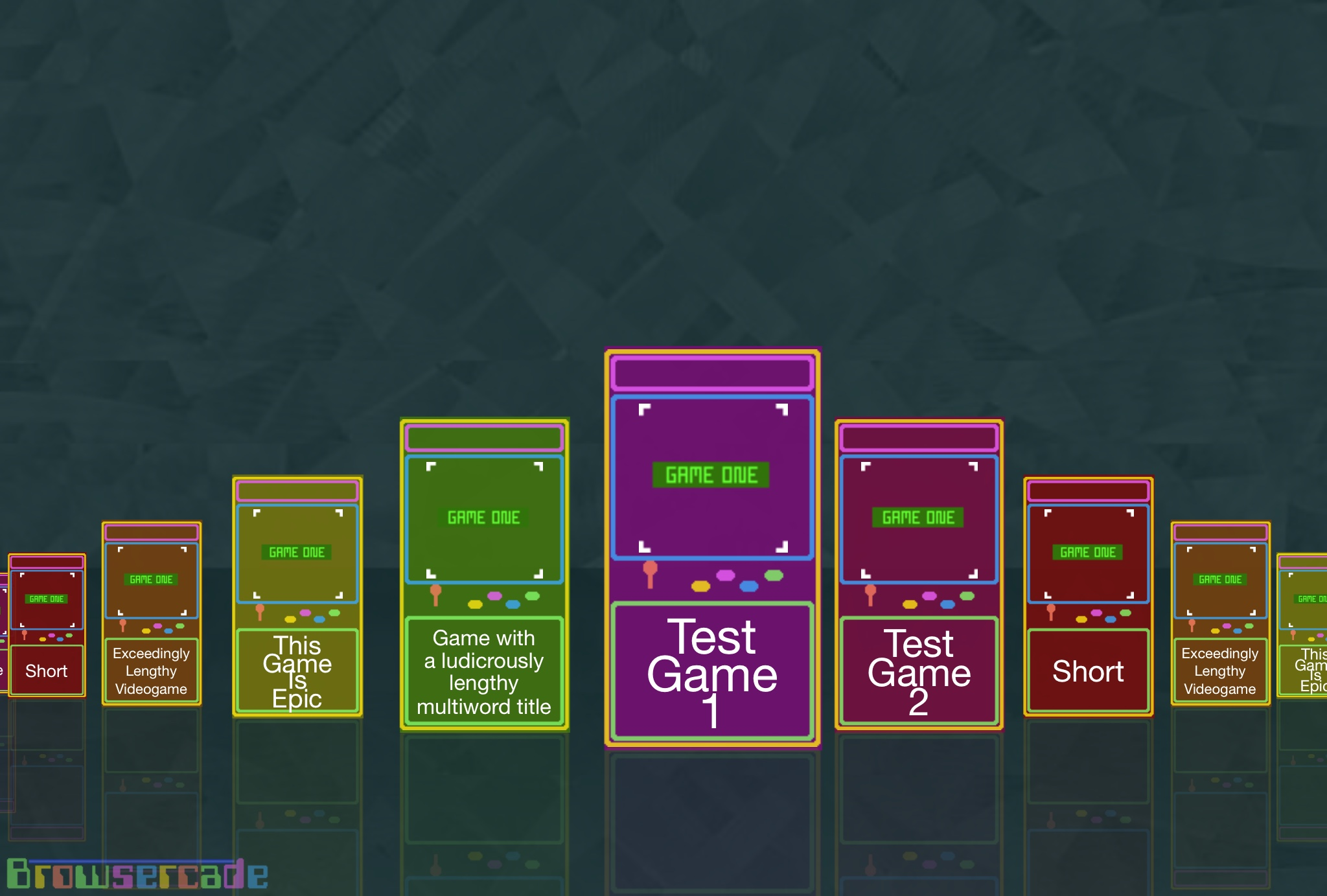
 After a couple of days of back&forth, I've finally decided "meh, whatever!" and opted to go for a Coverflow-RipOff style menu. It actually looks rather nice, and scrolls quite well, except on touchscreens where the thing's a teensy bit dodgy due to co-ordinate issues. But otherwise it works nicely. (Although it isn't "quite" centring properly!) Scroll around, select a game, sorted.. Currently all "games" lead to the exact same test engine, but eventually this will (hopefully!) be a massive collection of games! There's also a ton of space at the top for Options/Credits/etc -=-=- OrderingThere's no categories, this time. I'm RUBBISH at categorising my games, so I'm not even trying, this time around! Instead, it'll be one great big list, just as the current AGameAWeek games list is. I might add a vague filter method if things get too crazy, later on. I'm currently thinking Newest Game on the left, and Number all the Games, so you can keep track of your favourites along the way, and it's slightly easier to jump to the ones you like. I think.. Maybe!! A Better Cabinet Earlier today, @RSKGames sent a much nicer looking cabinet image with a little more depth to it, and I might yet end up using it. Thanks, @RSKGames!! Right now, however, the cabinet's looking a little bit cramped, and I've yet to add a Logo/Banner to the cabinet, so I'm slightly worried that everything might look a little too busy, and things may be a bit squished as a result. But as with all things, it'll be a case of "Get it working, first". If I CAN add @RSKGames' depth into the cabinet, then I will do! I might end up taking inspiration, and redrawing the cabinet with @RSKGames' depth additions, but trying to find a new scale so that everything fits a little better. *shrugs* Views 105, Upvotes 26
Browsercade
New games every week!
|


