|
|
New games every week!
JSE - GUI's aren't fun!
Blog
19th May 2021
The dream has been abandoned.
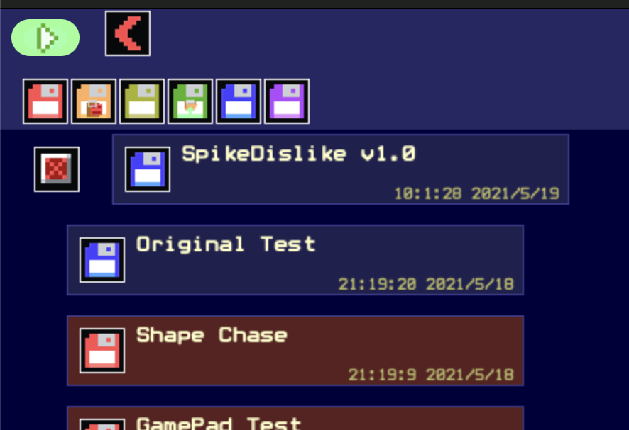
-=-=- A few days ago, I had epic dreams about a wonderful Workbench styled GUI to handle all the Projects. Drag and drop, windows, folders, the works. As I began trying to code it, a few stumbling blocks cropped up. Most notably that, if I DID do it like that, it'd be a pain to try and find "that project I was JUST working on.." because it would be inevitably lost in a maze of folders. In the end, I decided that the older "big pile of files in an ordered list" was actually more functional. So, I scrapped the whole Workbench styled GUI, and have stuck with the basic project list.  I have added Disks, though. Each project has a disk icon. Click the disk to move it to a different disk. There are 6 coloured disks to choose from. Up at the top of the GUI are these same disks. Click one to filter the projects so that only those on that disk will show up. This kinda works like the folders would've, but doesn't end up as a maze, and also keeps the most recent stuff up at the top. The orange and green disks have little labels on for "Imported" and "Pasted" projects.. The Imported one works fine, but I still can't get the browser to Paste projects properly. .. Plus, let's be honest, you can barely see those icons anyway! I'll probably scrap the labels!! Other than that, I hope you'll agree that this is a better suited management setup. Hopefully I didn't break anything along the way! As always, leave me a comment to let me know if you like/dislike the new setup. Views 108, Upvotes 21
Daily Blog
,
Jse
New games every week!
|


