|
|
New games every week!
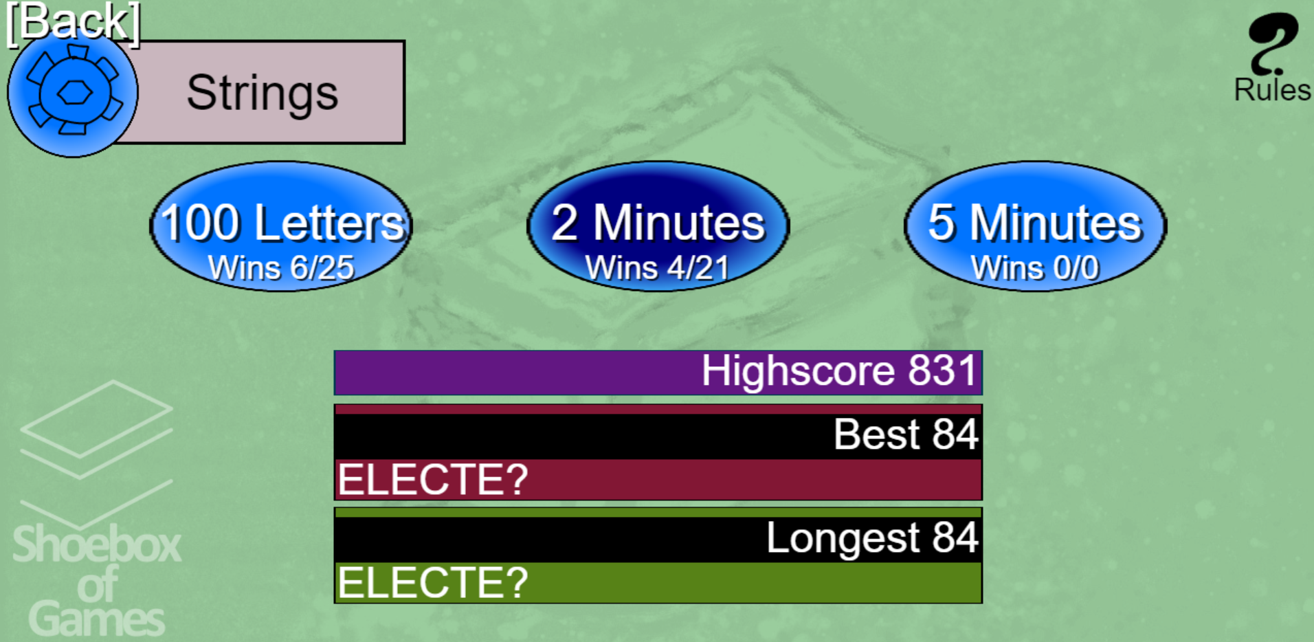
A Neater Menu...
Blog
25th February 2019
... But is it actually better?!  -=-=- It's certainly more obvious what are the buttons and what are the previous highscores. The "Game Over" scoreboard could also do with these boxes, so everything blends in a little more. .. But there's now an extra step between selecting a game, and starting the game. I hope that isn't too frustrating for people. I might also add a "Start Game" button on the bottom right, but still let the main buttons start the game, too. Hmmm... Could really do with actually bothering to design these kinds of things, if I'm honest. Views 189, Upvotes 82
Shoebox
New games every week!
|


