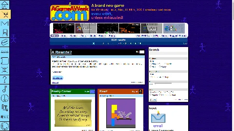
The first step in a long long trek, is to come up with a design for the icons.
-=-=-
I'm fairly happy with the style, but there's a couple of icons in there that aren't quite what they could be.
The SmileBASIC one, in particular, is looking extremely cluttered.
.. But it's a start.
The icons are transparent, btw, so the tabs will be getting their own design. I'm thinking pastel colours, with games being one colour, music another, art/poetry another. Then have that colour be the far-background colour for the site as a whole.
Seems like it should work.
I sure do hope it works!!

