|
|
New games every week!
Player Thoughts - Browsercade Games
Blog
29th June 2020
RSKGames has been posting a bunch of comments for some of the older (if you can call games from January and February "Old") Browsercade games.
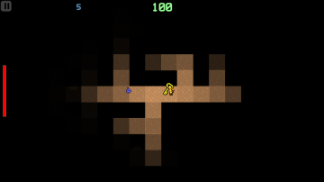
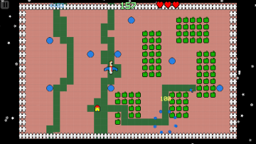
Let's have a peek! -=-=- Take This Torch A very atmospheric dungeon crawler where the player needs to avoid the enemies, find the key and open the door to the next level. It gets old rather quickly, though. I should probably expand the game to make it a little bigger, with extra collectables, powerups, different baddies and more, but I haven't (yet) attempted to bulk up any of the Browsercade games. I'm not sure what the rules should be, there, but considering I've not really used the "Easy/Normal/Hard" modes, I can easily make them "Classic/Enhanced" modes, instead. Hmmm.. The simmering tiles effect due the torch looks fantastic. The light going out and coming back when executing the burn attack also looks great. The open door sprite and player walking down animation are done well. The torch effect was the first thing created for this game, and it took an alarming amount of time to get it looking decent without being "too" flickery. For far too long, the flickering would be incredibly distracting, but after a little effort, I think I managed to whittle it down to be something that I was comfortable to look at while playing. Subtlety is the key! The upgrades of potion that increases the burn effect on the enemies and the extra health increases the playtime are effective. I managed to reach level 4 where the enemies are too fast to avoid or kill. Yeah, another case of "Ran out of ideas, just make the enemies harder!" If the game had more to it (collectables, powerups, etc) then I could reduce the difficulty of the bad guys, and make the game last a bit longer. As it is, it becomes far too repetitive and dull, so.. I made it harder, instead! This is a fairly common thing in my games  The background music is too peppy for an ominous game like this where as the level progresses bigger and badder enemies almost instakill the player. Yep... Bad music choice. I've since written a number of slower choons, but still nothing has the right "exploration/darkness" theme to it. I keep making cheery choons!! Overall a very enjoyable dungeon crawler. But could definitely be better.. With a few subtle tweaks, and a larger inventory, it could be a bigger and more interesting game. Heck, I could probably go the whole hog, and turn it into a giant romping adventure. .. Maybe?! Cosmic Gardener Cosmic Gardener is one of the games made by JNK where I cannot complain about the game length. Players can play the game as long as possible. After a series of tough and short games this game was a pleasant surprise. LOL. Are my games THAT hard?! Hmm.. Maybe so.  The ball bouncing weapon mechanic is implemented very well. It is a homing weapon for the enemies while it is a boomerang for the player to catch after throwing. After a period of time the ball spans back to the player if it has not hit anything. Spamming is not possible as it takes time to form after killing the enemy. I liked the enemy AI where the enemy spanner after spanning 5 enemies becomes a muffin giving 500 points, if the player is safely borrowed in some deep hole and killing the enemies one by one then the last 2 or 3 enemies will hold back near the muffin for the player to make a move to some easier spots to chase. After killing all the enemies in a level the player can peacefully farm the veggies and fruits to complete the level unless the player is careless and hit by the big boulder will farming. Overall a very relaxing and fun game. As much as I'd love to take credit for all of this, pretty much everything above is a direct rip-off of the classic "Mr Do". Credit goes to whoever at Universal Entertainment came up with the mechanics. I don't do many "Just a really obvious rip-off" games, but Mr Do (or, more specifically, Bob's Garden on the Amiga!) has always been a favourite to remake. If I had any grumbles, it's that the player sprite is TINY!! I made Platdude half the size as the other sprites, thinking he looked a bit large, otherwise, with him being the same size as his house! The game world's logic didn't fit the graphics, so I made him smaller. Instead, I should've made the house sprite larger, and left Platdude at 1x size, instead. .. Gets a bit "squinty" at times. Maybe I oughta take a month off from making "new" games, and instead I can spend some time bulking up some of the Browsercade collection.. Make a few "Enhanced" modes, fix up a few of the odd issues, maybe do some new choons.. things like that. And maybe fix up some of the AI in the Shoebox, too!!? That sounds like it might be a good plan.. Views 325, Upvotes 69
Player Thoughts
,
Feedback
,
Browsercade
New games every week!
|


